
NASA x Adobe Creative Jam
An app that teaches kids about NASA missions for the Adobe x NASA Creative Jam.
Role: Product Manager, UX designer, researcher, presenter (My partner’s role: User Interface/Visual Designer)
Tools: Adobe XD, Miro
Summary
Surveys have shown that kids are three times more likely to aspire to be a YouTuber than an Astronaut. To inspire future astronauts, my partner Laura and I leveraged gamification in the design of an app to make learning about space entertaining.
Our submission earned 3rd place (out of 173 submissions) because of its alignment with the challenge prompt and target audience, as well as its commitment to accessibility.
#2021 #ios #ux/ui #prototype
Challenge
Design an iPad app that provides an engaging way for kids ages 11-13 to learn space stories and facts about one or more NASA Jet Propulsion Laboratory (JPL) missions.
Discovery research
Day 1 was dedicated to secondary research on the target user. Based on our findings, I created a proto-persona to reference throughout the design process.
Two characteristics of the target users:
Dislike being treated like children
Retain more via hands-on learning
Early prototypes
We each sketched two approaches to the challenge.
I digitized and annotated both to keep a repository of ideas to use later.
I gathered feedback from three peers. Based on their feedback, we chose the second concept (bottom row) because the game flow was more intuitive, and the difficulty level would be adjustable as we learned more about our users.
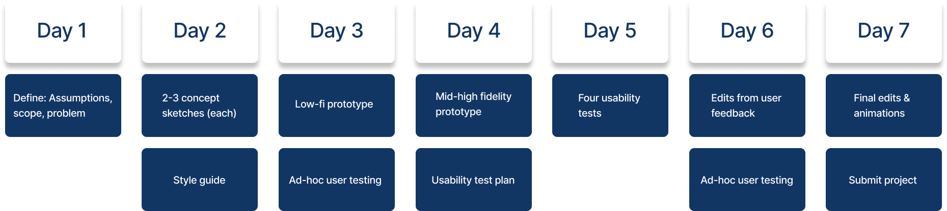
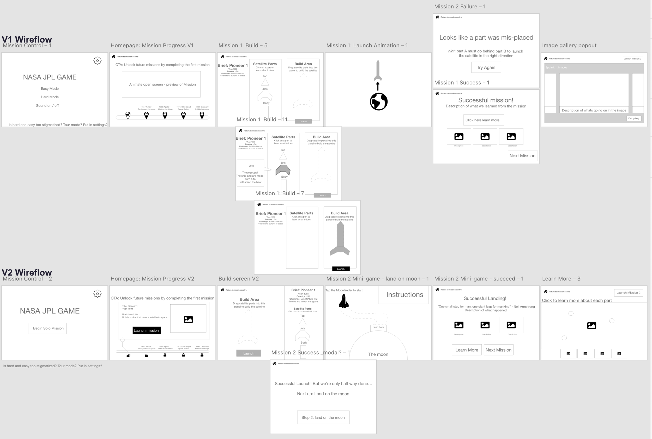
Greyscale prototype
While Laura focused on style and branding, I built two wireflows and gathered feedback on the app’s core path.
Based on the insight that ages 11-13 dislike being treated like children, we made the assumption that they would perceive the app akin to others who have little-to-no space knowledge (regardless of age).
For this reason, we rationalized that people ages 24-30 could serve as a proxy for our target users when gathering feedback.
Style tile
Laura sourced pictures of space to create color palettes.
We picked the top right option because the blue tones were the easiest on the eyes without sacrificing contrast.
Laura also compiled typeface options— we picked Good Times and Arial for thematic reasons.
We also included the ability to change the typeface to OpenDyslexic or Arial-only, for accessibility purposes.
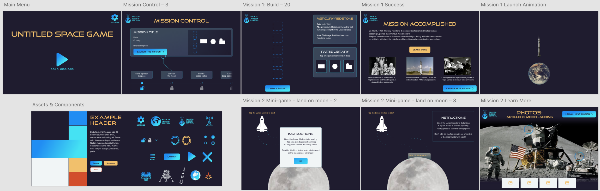
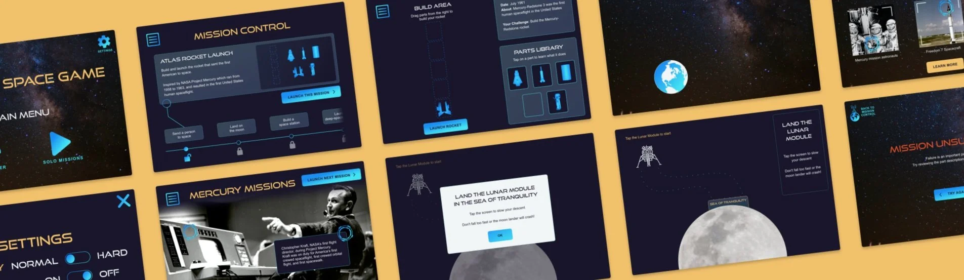
Mid/Hi-fidelity prototype
We transformed wireframes into a complete prototype. We used the Adobe XD icon plugin as placeholders and later designed our own to swap in.
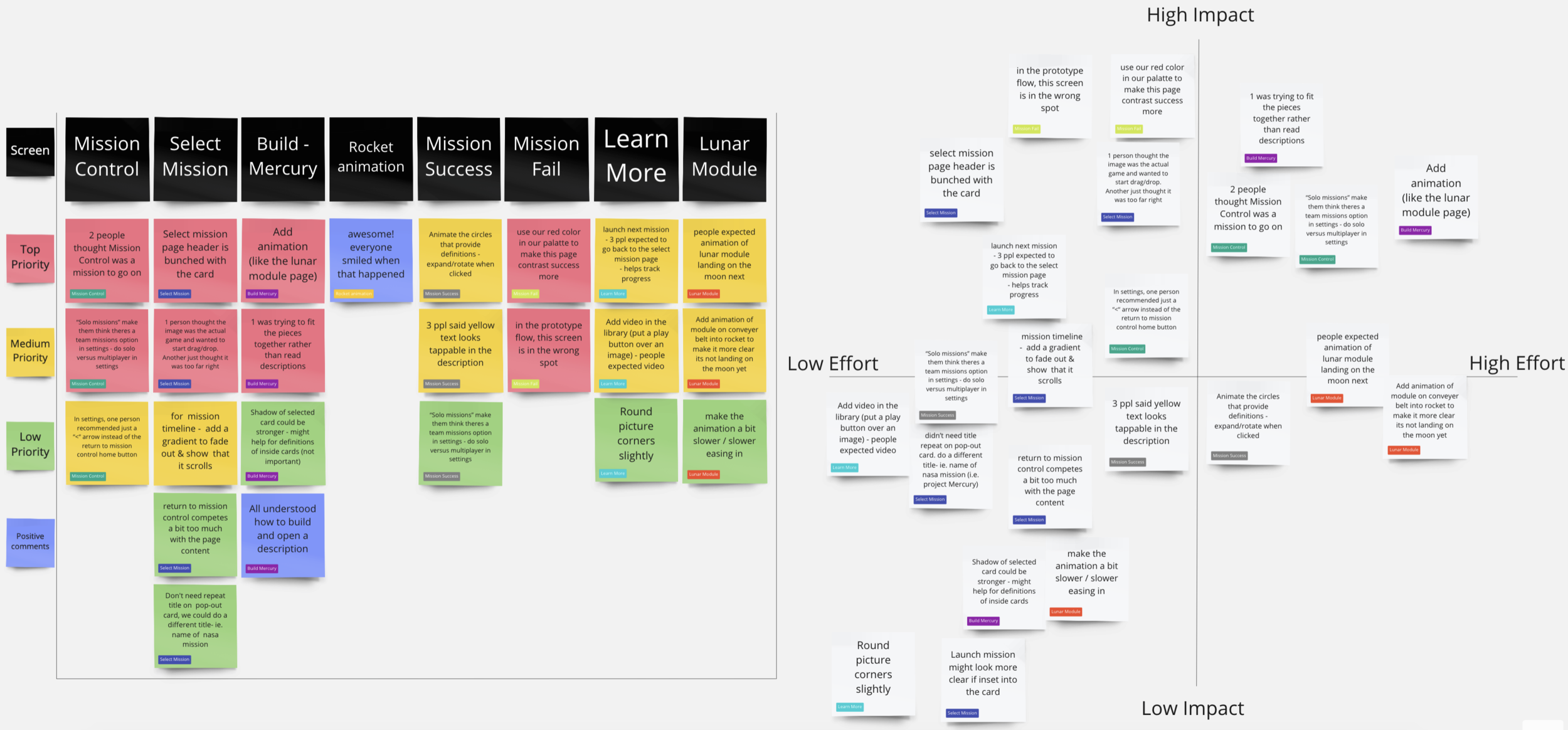
Usability testing
Once we reached a mid-fi prototype, I created a usability test plan to ensure the final days could be dedicated to implementing user feedback and refining the prototype.
Key changes after usability testing:
Our “home” button read “Return to Mission Control” but zero participants understood what mission control was. Laura changed it to a hamburger menu.
For the rocket-building activity, two participants tried to build based on shape rather than the part descriptions. To encourage reading the descriptions, we updated the appearance of the parts to not fit together like a puzzle.
Participants expected the missions to incrementally become more difficult. We combined the building activity with the mini-game for Mission #2 to demonstrate extra steps being added as players level up.
Final prototype
We spent the final three days implementing feedback from usability research and adding animations for interactive components and transitions.
3rd place submission
Of 173 submissions, our project was selected as one of twelve finalists to be presented to a panel of judges. As team lead, I delivered a three-minute presentation highlighting the key features of our project, after which we were awarded third place.
The judges commended our submission for:
Accurately addressing the challenge prompt
Aligning with our target audience
Prioritizing accessibility
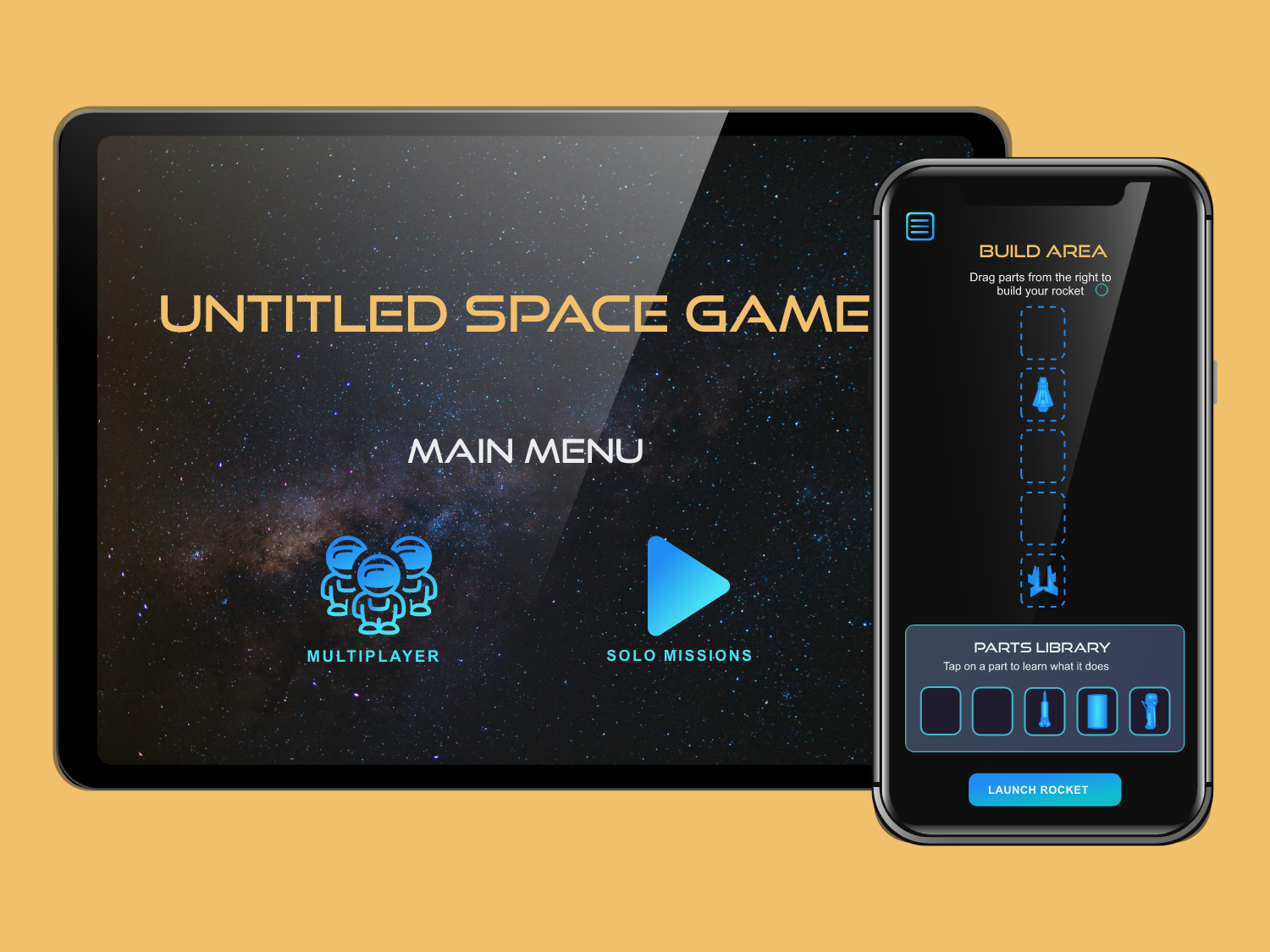
Mobile prototype
During usability tests, several participants ages 24-30 expressed interest in playing the game themselves.
With this in mind, I independently decided to explore what the app could look like on Mobile- a more commonly used device.
I stacked the content blocks to create a vertical layout and prioritized keeping key interactions within the thumb zone.
Lessons learned
Designing quickly: Given the 1-week timeframe, Laura and I were challenged to commit to our Day 1 idea and rationalize design decisions based on our understanding of best practices to keep moving forward.
How to use animation and interaction to make a realistic prototype with Adobe XD
A lot of space facts!