
Recover Athletics
Redesigned responsive website for Recover Athletics: a startup centered around their physical therapy app.
Role: UX/UI designer
Timeline: 1 Month
Methods: Discovery research, Personas, Information Architecture, Prototyping
Tools: Figma, Miro
Background
Recover Athletics is a prehab physical therapy (PT) app for runners.
Purpose of redesign: Recover aimed to expand its target audience to endurance athletes (instead of runners-only). Amid accelerating customer growth, investors also felt the website lacked professionalism.
Project goals:
Inform endurance athletes and prospective investors of the Recover app’s value
Direct website visitors to relevant health and injury prevention resources
#2021 #ux/ui #freelance #responsivedesign #rebrand

Preliminary research
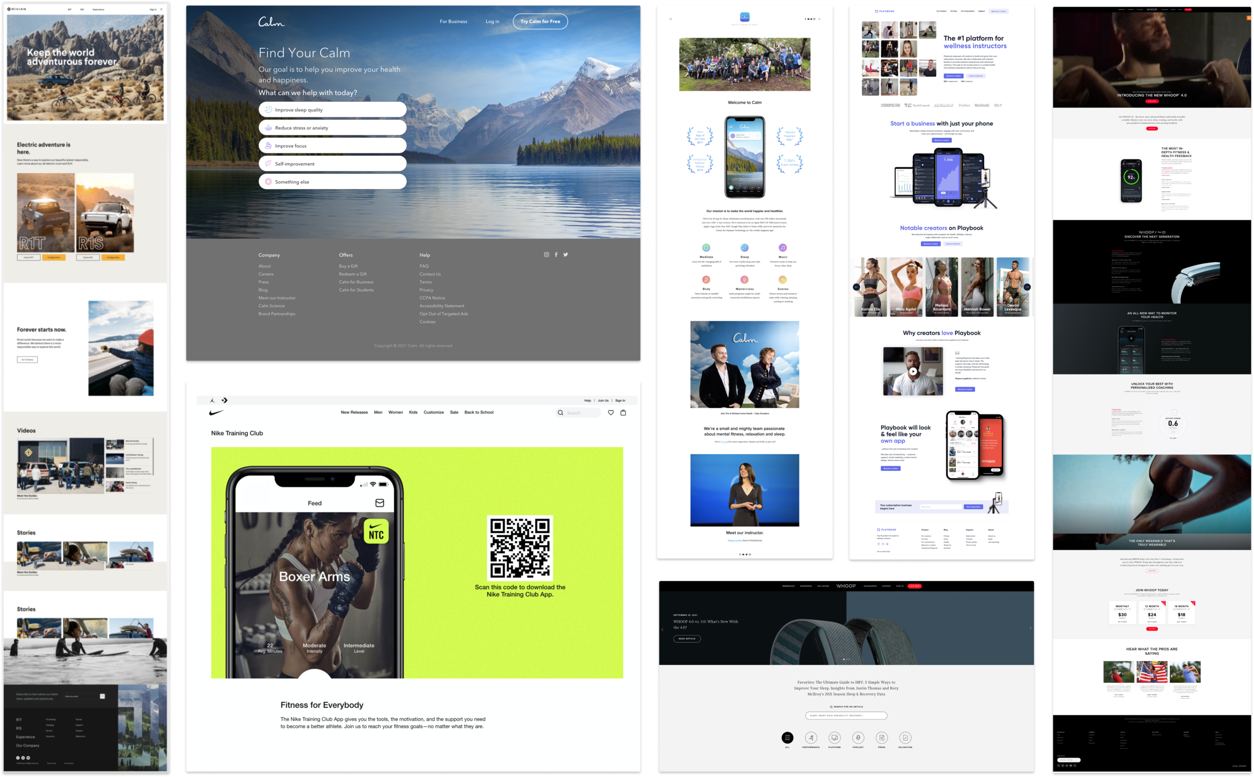
To understand the strengths & areas for improvement on RA’s website, I reviewed competitor websites and completed a heuristic evaluation.
Key finding: The blog was absent from the homepage despite accounting for the majority of the site traffic. To find the blog, users had to know where it was hidden.
Hypothesis: advertising the blog from the homepage would convey credibility and increase blog subscribers.
User Research
1-hour interviews: 5 target users, 2 investors
30 mins: Discovery- fitness apps
Which fitness apps do they use/invest in
Why
How did they learn about them
30 mins: Usability test of Recover’s site
Which content did they pay attention to
What (if anything) seemed to be missing
Findings: User motivations
Investors need to understand whether Recover Athletics is the next ‘big thing’.
Athletes need to understand how the app will optimize their fitness.
“I’m concerned that the lack of consistency in the website design means the Recover app also contains design flaws“
— Investor
“I want to know where the app is sourcing these exercises from… can it reliably prevent injury or is it a gimmick?”
— Endurance Athlete
Sitemap
This was developed to align with stakeholders on site structure.
Although we decided to keep the same information architecture, we planned to add content* to each page.
*eg. add content customers expected, such as news features to the homepage for credibility.
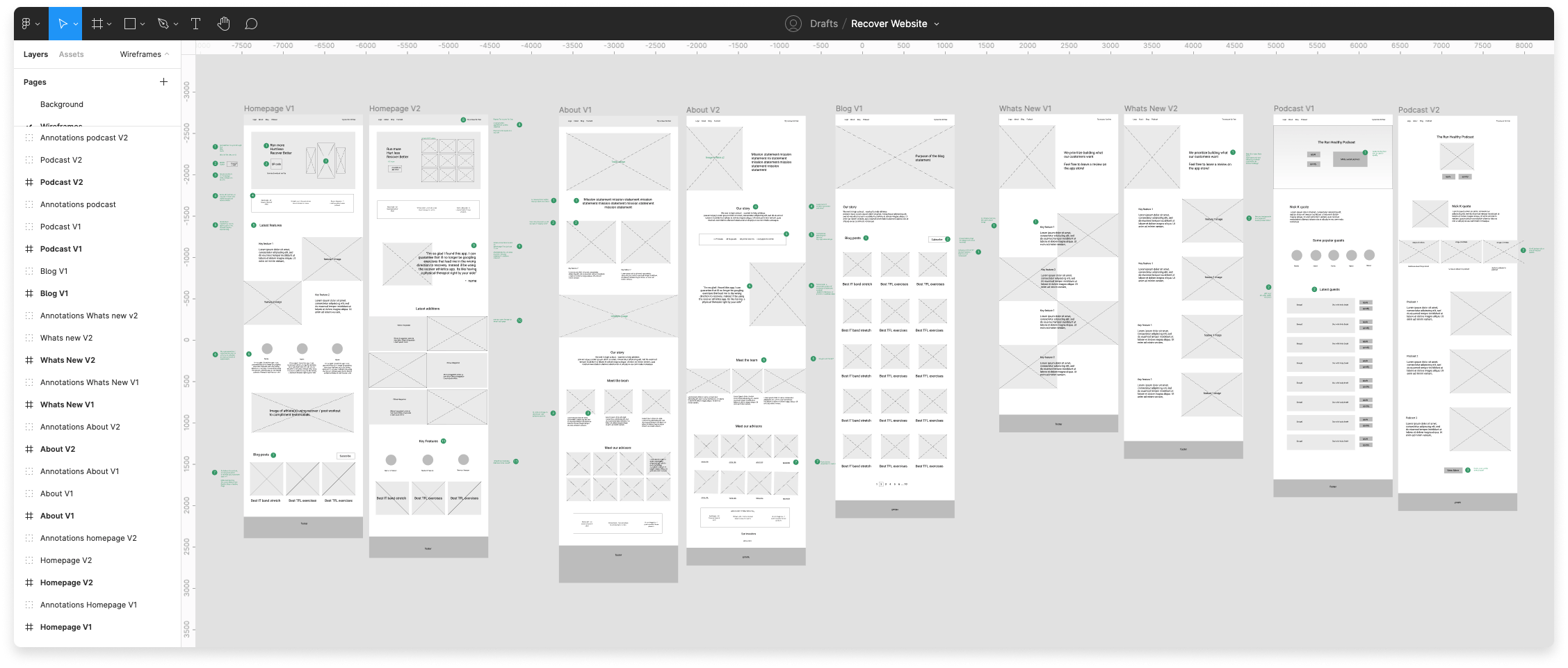
Low-Fidelity Mockups
Annotated low-fi mockups facilitated discussions on content and structure. We identified 3 assumptions to test with users:
The site communicates that Recover is a mobile app
Customers use the QR code to download the app via desktop (rather than the app store button)
Testimonials and news articles add credibility
Style guide
The co-founders provided a list of adjectives to describe the desired brand aesthetic:
Welcoming, trustworthy, clear, informative, light-hearted, athletic, scientific, outdoorsy, friendly, adventurous.
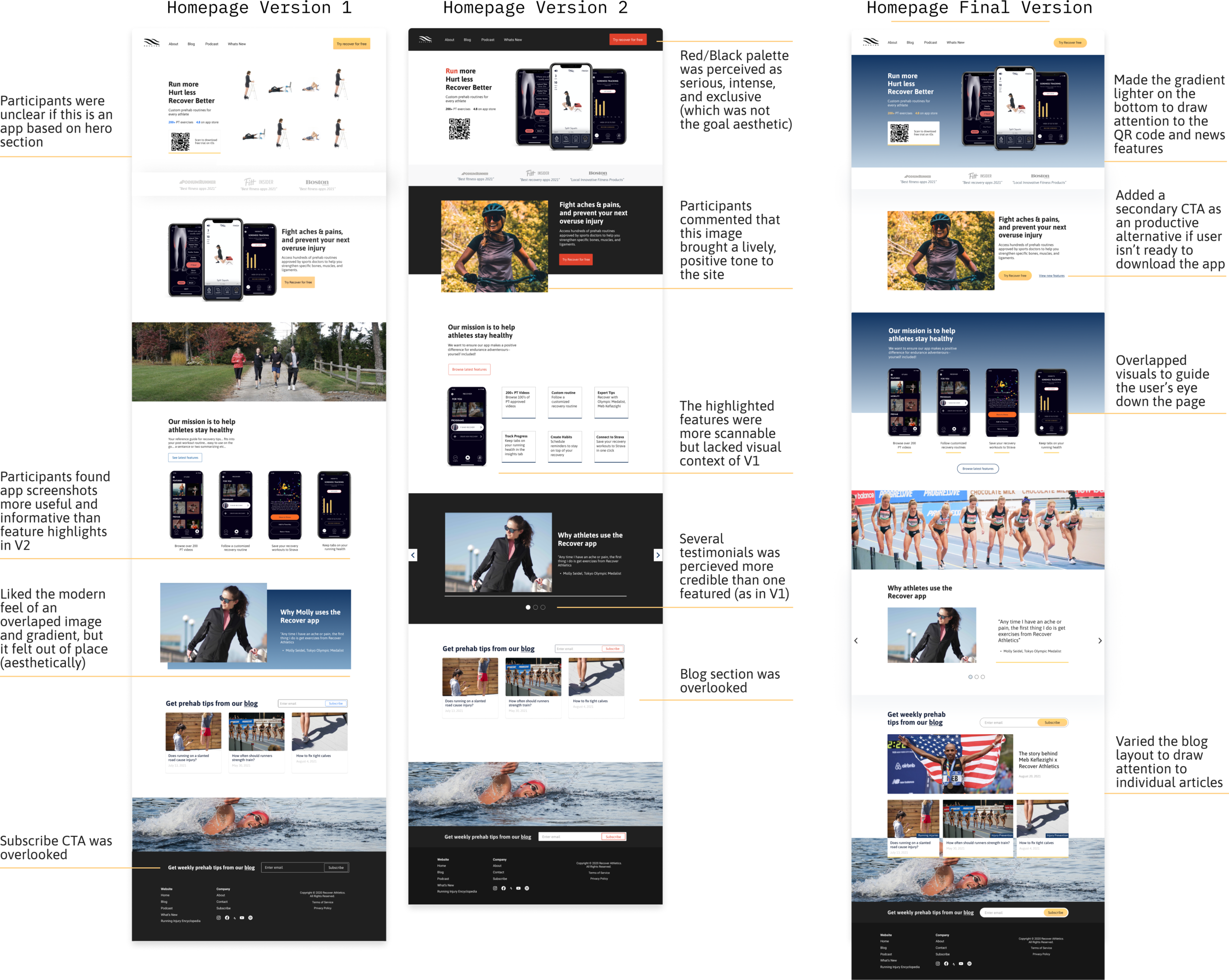
Homepage* A/B Test
Six A/B tests on two homepage prototypes helped merge the best qualities of each.
Although A/B testing is most effective when comparing minor differences between options, I rationalized that alternating the order of presentation would help control for hindsight and anchoring bias.
*We focused on the homepage to establish the visual style because other pages would adopt the same system.
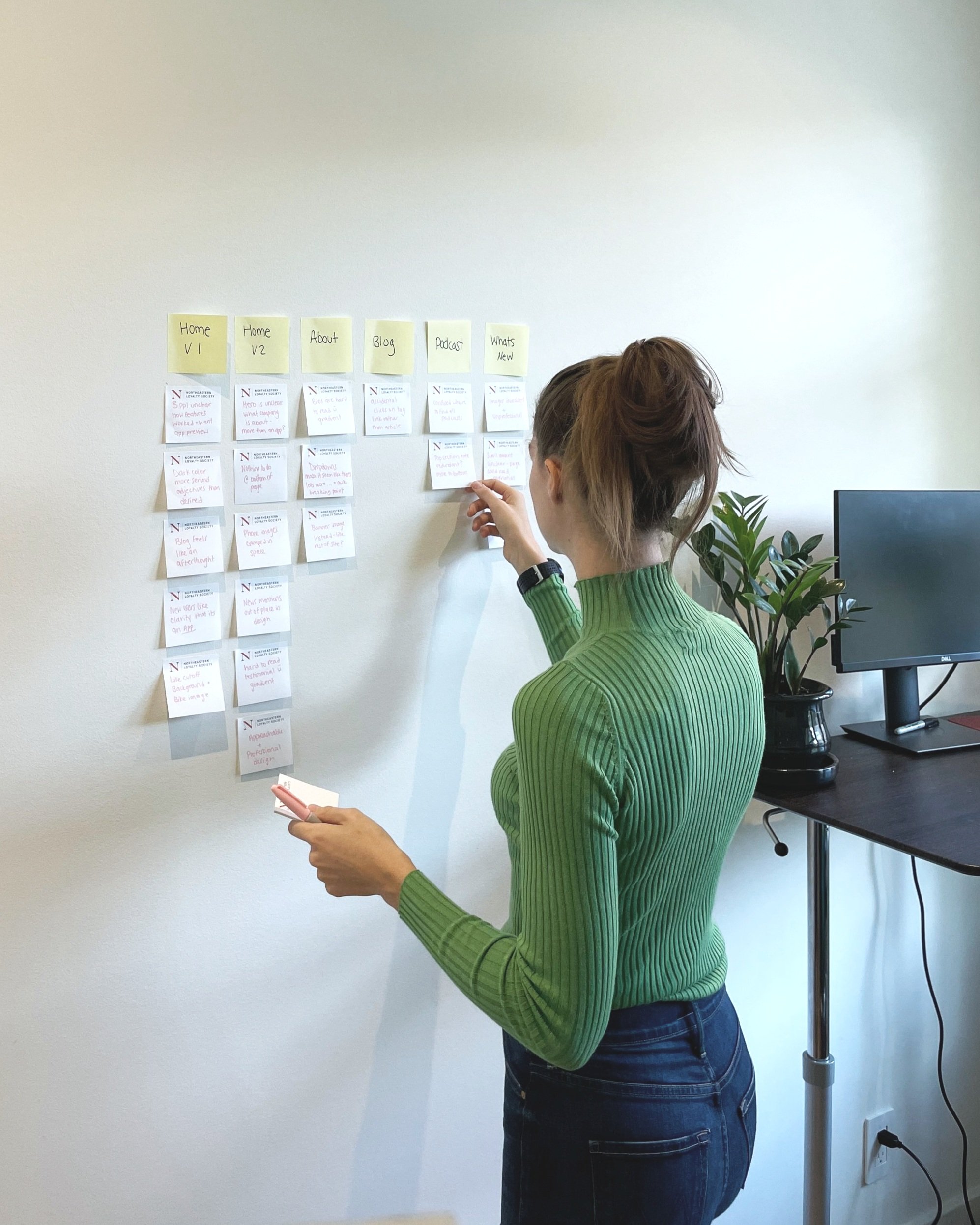
Usability testing
After designing all remaining pages, I conducted five usability tests for desktop and mobile.
Key changes:
Organized blog content: Categorized and featured popular articles
Second conversion opportunity: fixed the nav bar to follow the scroll and added a newsletter sign-up CTA
Blog access: Linked images to articles (and removed misleading links)
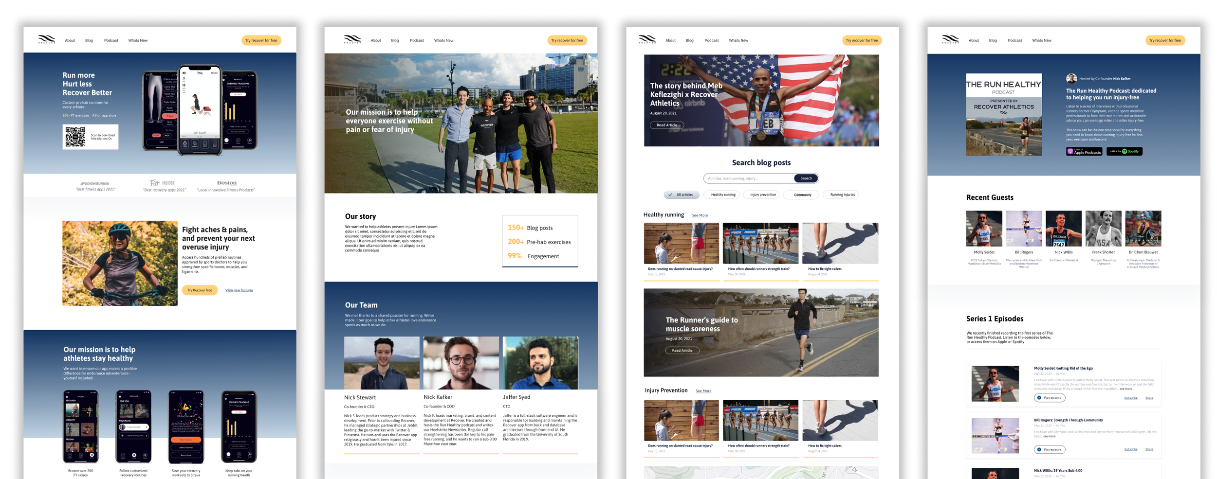
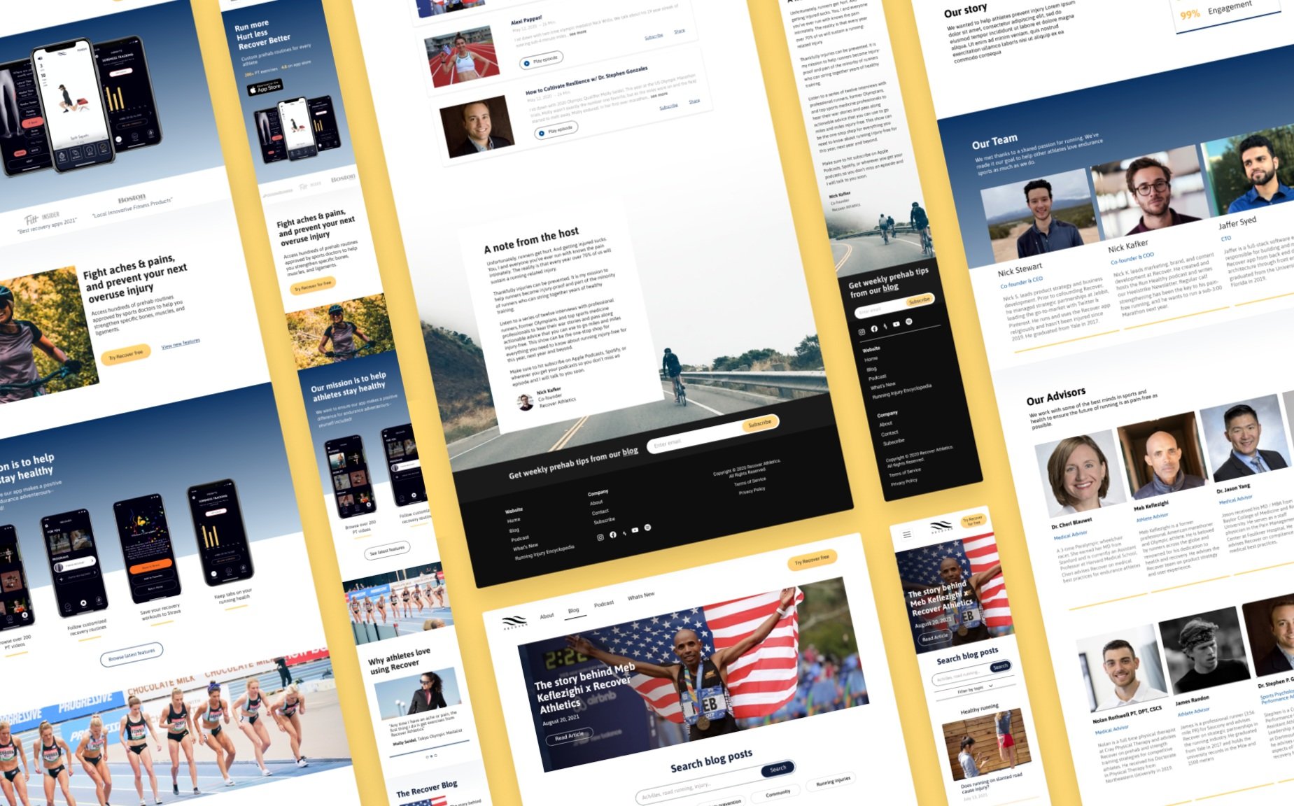
Final prototype
Reflection
This project focused on communicating product value. Despite the short timeline, we fit in a series of UX Research methods to develop a concept that aligned with both user & business needs.
With more time: I would A/B test the new and existing homepage (with KPI metrics) to directly compare performance.
Insight: It can be daunting for stakeholders to give feedback on wireframes— especially when the format is unfamiliar. While the wireframes helped define a page structure, adding placeholder images made ideas clearer and more approachable in followup discussions.
Note: Strava acquired Recover before the new website could be implemented (I guess they didn’t really need a new site after all! lol).