Avant Time Travel
A responsive e-commerce website for a fictional enterprise.
Role: UX/UI & visual designer
Tools: XD, Optimal Sort, Illustrator, Miro, Whimsical
Background
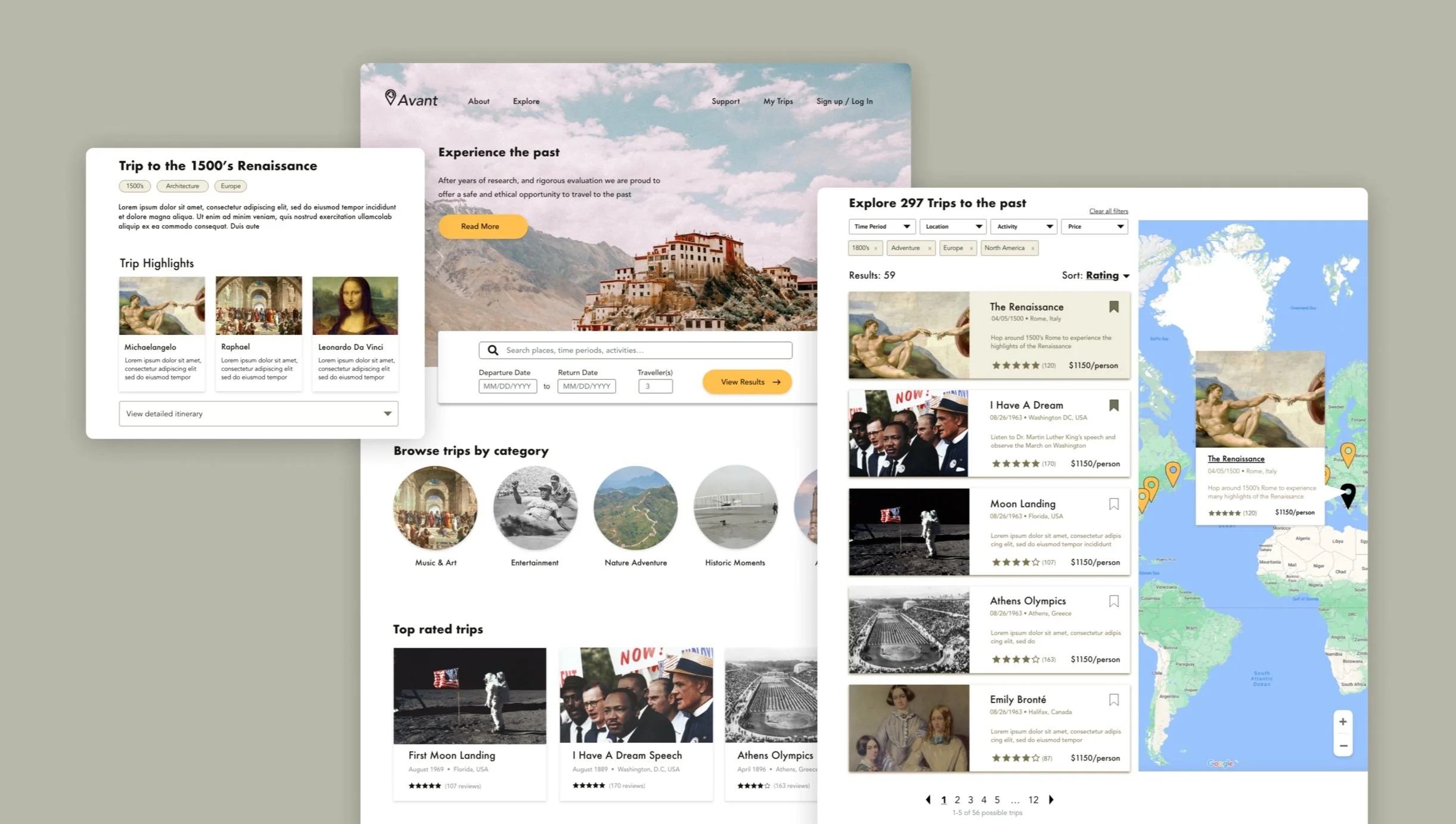
This case study responds to a theoretical prompt: Avant launched the first time travel service with 289 destinations set in the past. My objective was to create a modern, yet historic brand identity, and design an e-commerce site that allows customers to browse and book a range of trips.
Designing for a technology that doesn’t currently exist means there were no direct competitors, and no customers to gather experience-based insights specific to time travel. With this in mind, I substituted adventure travel as a proxy to understand customer needs regarding time travel.
Competitive Analysis
Assumption: Travel and adventure websites address similar user needs to a time travel website, and can therefore be analyzed as indirect competitors.
Qualities found across travel websites:
Flexible filter options to find the desired trip
Trip suggestions and package offerings
Clean UI, appealing images of offerings
Clear cancellation policies
Persona
I conducted six 1:1 discovery interviews with volunteers from a range of backgrounds to identify important factors that influence trip planning.
Assumption: People perceive time travel as similar to other adventurous travel (i.e. space, exploration)- adventurous travelers may serve as provisionary time travel target customers.
Key Research Questions
Why do people travel?
What do people like / dislike about travel?
How do people feel about time travel? (motivations and/or concerns)
Card Sort: Search Filters
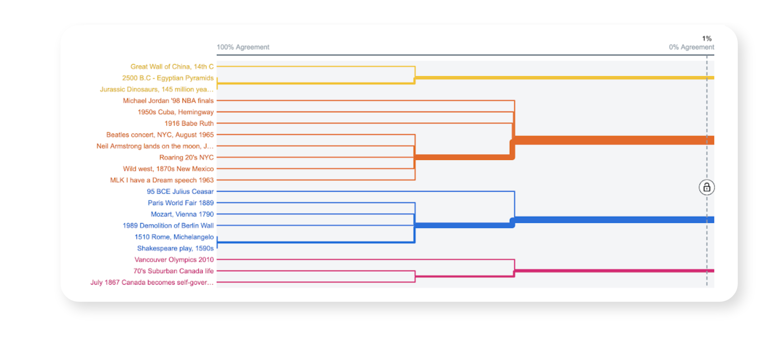
An open card sort to observe how users* categorize 20 trip activities & determine which trip filters to offer.
Result: Time period, geographic location, and event type were the most common categories
*I aimed for the recommended 15 participants, but only 9 adventurous travelers participated within the allocated time.
User & task flow
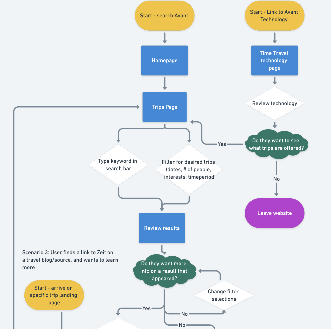
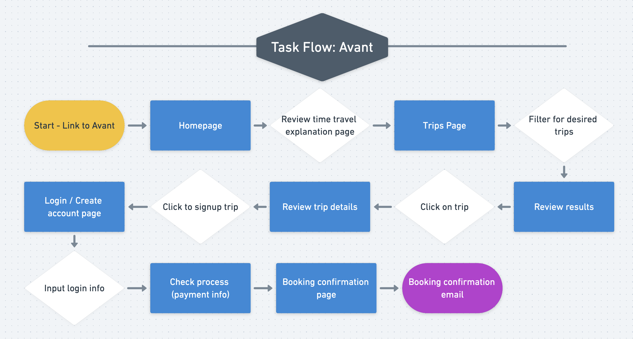
The userflow visualized the macro-structure of the site and identified a specific task flow to guide prototyping.
The flow I worked on was ‘discover—select—review—checkout’ because the primary purpose of the website was to support the trip signup process.
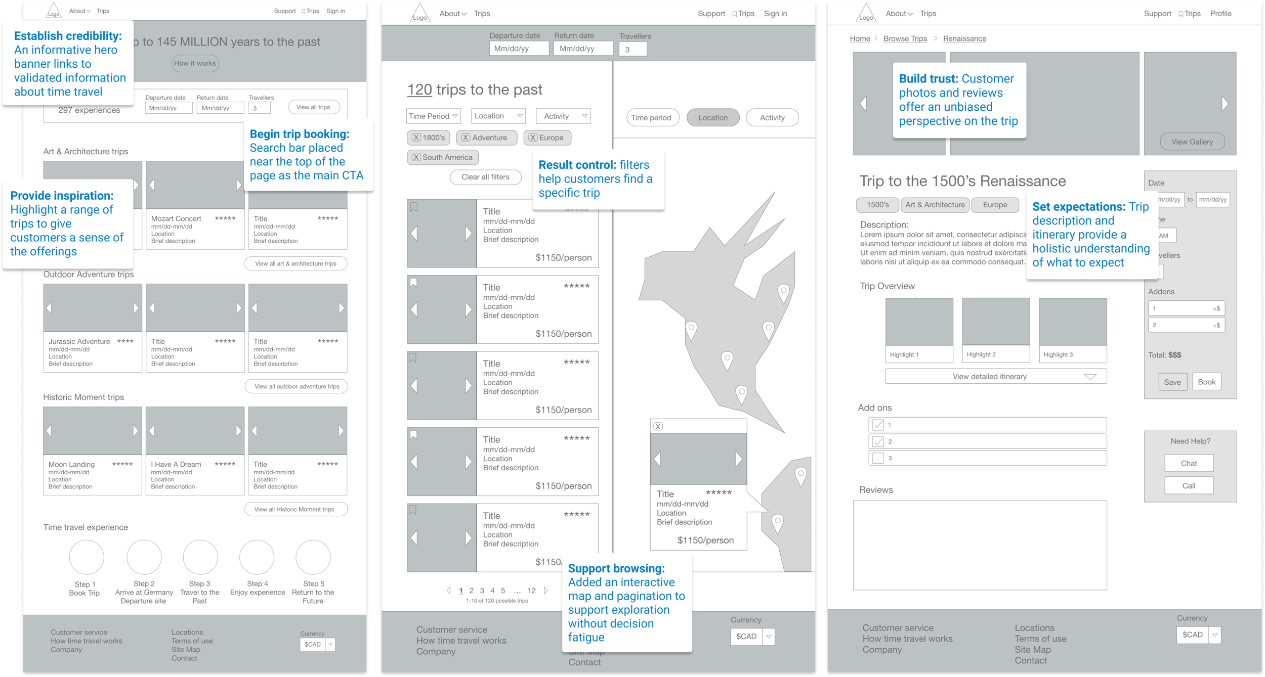
Wireframes: Happy Path
I used XD to iteratively design three screens for booking a trip. For each screen, I defined a purpose to address in the design, as highlighted below:
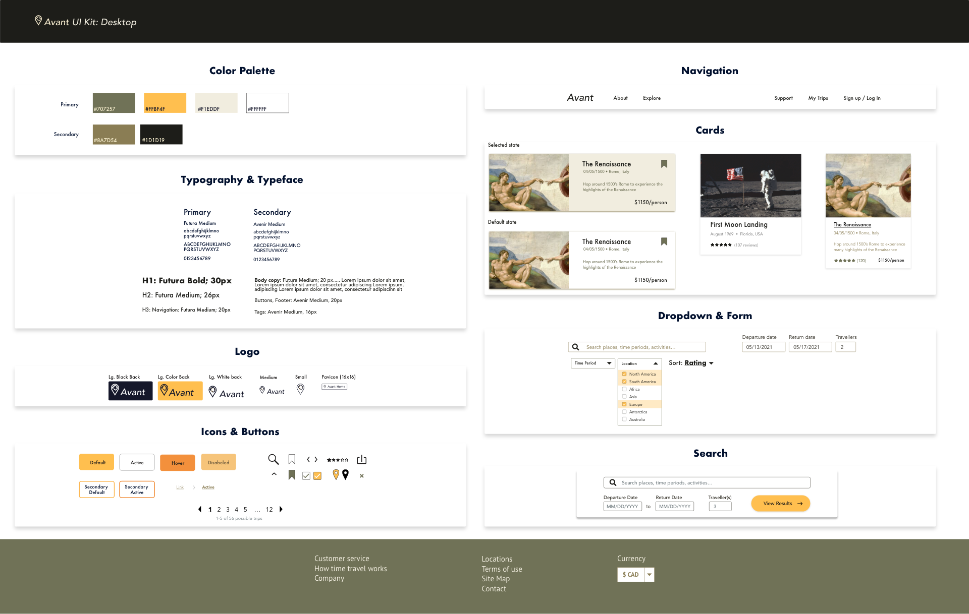
Logo & UI Kit
Mood boarding provided brand identity inspiration for a modern and historic aesthetic. I originally found inspiration from the National Geographic website and superimposed a high contrast, black & white palette with gold highlights onto the wireframes.
According to feedback, the high contrast was perceived as intimidating and unpolished. To soften the apperance, I reduced the dark content blocks and opted for drop shadows.
I also sketched logos and chose the logo that received the most positive feedback regarding alignment with the style tile aesthetic.
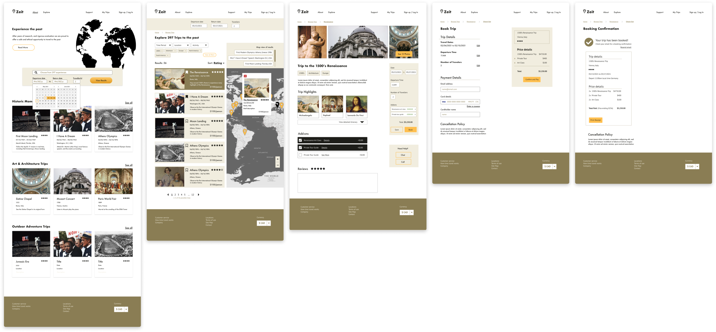
Hi-fidelity Prototype
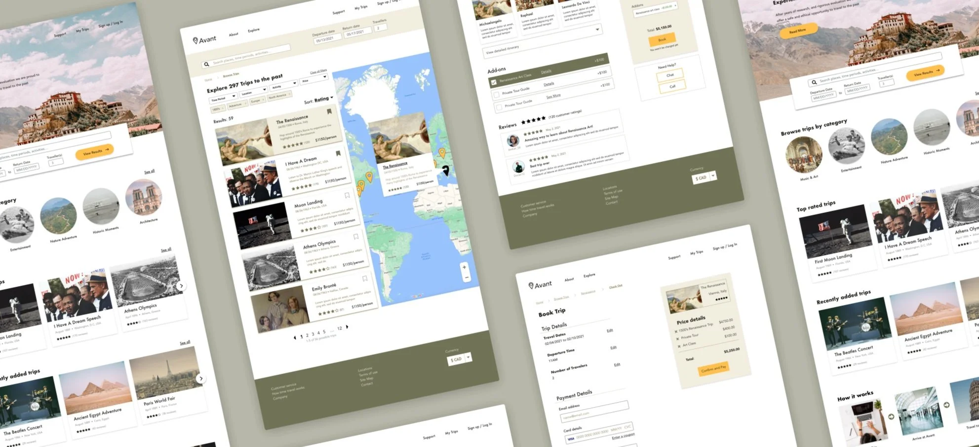
Peer feedback helped refine the prototype and add screens to complete the flow from homepage to booking confirmation page.
Key updates:
Added checkout and checkout confirmation page
Added a scrollable list of trips for scannability on the search page.
Implemented a trip summary panel on the trip page to help users get a sense of the experience at a glance.
Usability Test
Five participants that met screening criteria (adventurous traveler, books trips online, age 21+) participated in 30-minute 1:1 remote usability testing sessions.
The goal of the research was to learn the strengths and weaknesses of Avant’s booking process for new users. More specifically— how customers navigate the site, and which features are used/ignored in the trip booking process.
Research Questions
How do people feel about time travel? (what motivates and/or concerns them)
Can participants navigate the website? If not, how do they resolve/respond to challenges?
Which features do participants ignore and/or pay attention to when booking a trip?
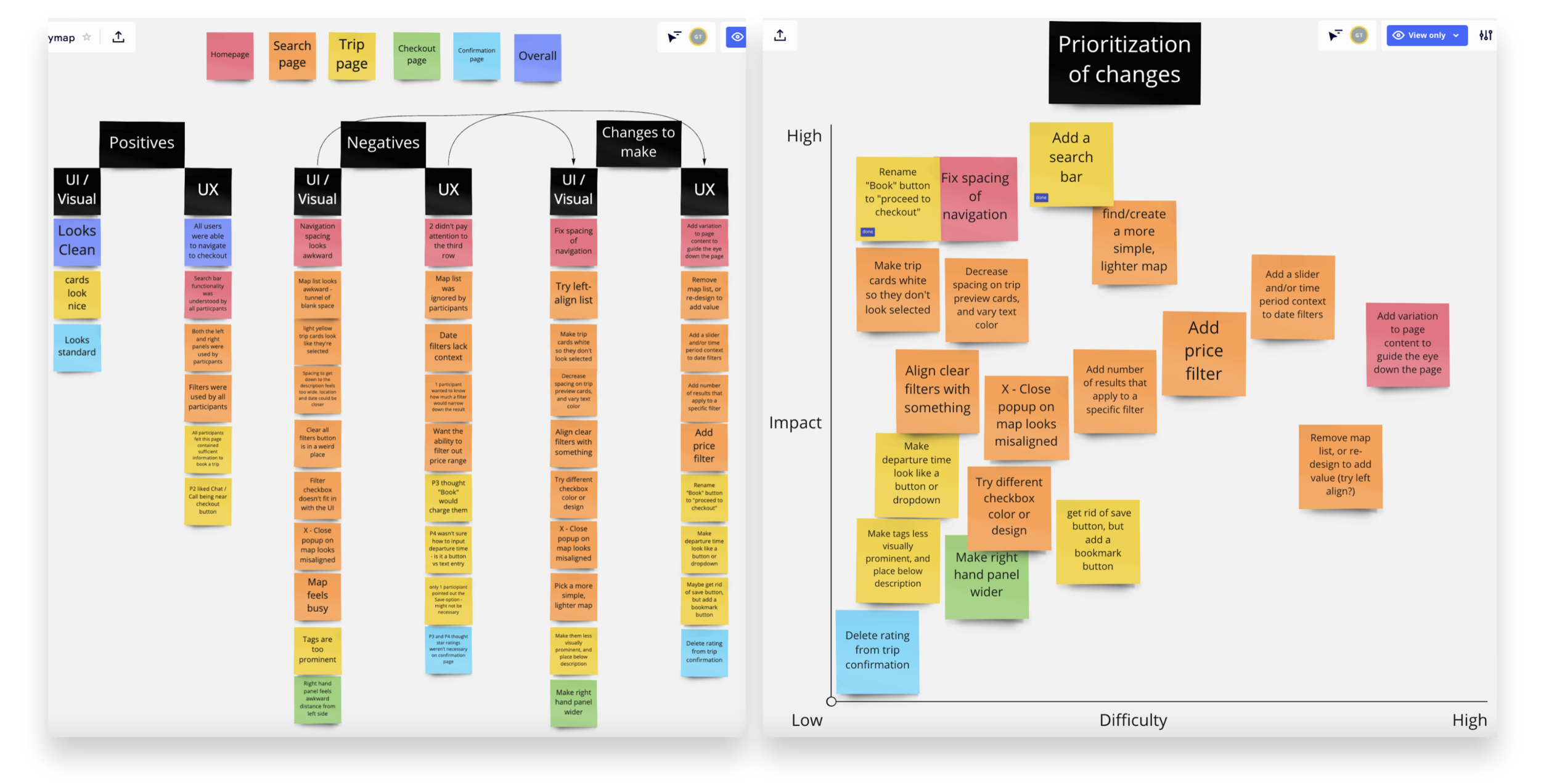
Affinitized usability test notes (left), prioritized updates for final version (right)
Click-through prototype
Post-usability test, several visual and structural changes were made according to the user feedback, including:
Homepage: participants tended to glance over the lower content. To increase engagement, I varied the layout for different sections.
Search page: participants did not interact with the scannable list above the map, suggesting that it did not add value in its proposed form. I removed it and extended the map.
Trip page: Participants were hesitant to click Book because they weren’t sure if they were going to be automatically charged. I added subtext explaining that payment would not occur until later.
Reflection
Given the limited scope of this project, I focused on the “happy path” despite the fact that users inevitably use the site differently than intended. In future work, I would explore areas of confusion and implement guidelines to help users recover from errors.
With more time, I would also create responsive versions of the site and implement several backlogged features (i.e. bookmarked trips, a revised approach to the list view of trips).

